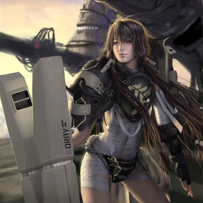
The amount of detail in the metal and design to accurately reflect the 2D anime robot is so crazy. Metal is always hard to get right with small scratches and dents and everything is hard to model, but he does it like it was nothing. He usuall takes about three days of work too. If ONLY I could do something like this and I hope to be able to in the future. Next take a look at a different style, with an anime woman rendered on a fuchikoma:
 The fuchikoma above is the same one as above, just turned around to fit the image. The background is actually a stock image edited to fit the whole composition. The woman is new and man does she look great. She is the main character from Ghost in the Shell. And personally I believe she is well done here. Wen-JR does what I want to do. This is the future of most art as it enters the digital age. I now leave you with another of his pieces. WARNING, the picture may not be suitable for some people so do not look if you do not wanna see:

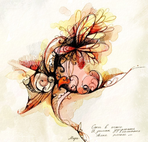
 The last three posts and now finally including this one were all found by searching for celestial. I end this series with this vector-like art. It is indeed great to look at, but what of the process that went into making this? My answer is that I wish I knew. I would love to make great vector art like this, but I have little knowledge and talent in making something even basic. Which is why I need to extend my knowledge like everyone else should. We should all never stop learning in what we love to do. Mine is Video games and then graphic art, so I will always be looking into those. It today’s world and economy, we can not afford to fall behind in out personal learning. It is essential to get to where you want to be in your life.

 Texture is what you feel when you touch something physically. Above is an image with a visible texture which was used to give it a grungy effect. The human mind always wants to make the body touch things, me included. I always think "What if I touched it?" or "What does it feel like?" Well that only happens when I can't make a guess. Here I can make a guess. It is grungy so it would feel like rough or hard, although it is shiny in the corner and dark in the others, like it should be soft. Everything has a texture but you can make some things more interesting by giving it a visual texture aside from its physical one. I will always wonder how people come up with these textures as it is easy to know that they took an image in photoshop and overplayed the texture onto it. Aside from that, the image is pretty nice.

 While this image looks awesome and the manipulation to make it look gloomy and in terror is simply just awesome, that is not why I chose it this time around. It is more of a parody on violence in urban areas. The only people are is maybe those in cars or maybe the guy walking on the right. What does it mean? It shows just how people are just turning a blind eye to all these events, even if they are out in the open. Gangs and other criminals do what they want until they kill someone or rob a convenient store and are caught on camera or something. Tthis picture can give you the wrong idea with the monster things attacking, but it is meant to be ridiculous to throw you off. It is just an example of how we are too busy with our own personal issues to even look at the problems around us.
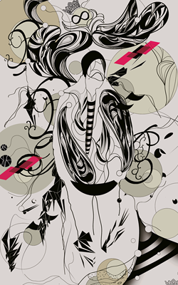
 Here is something I see less uncommon these days. It is a very simple process as well. You take a hand drawn, uncolored art like this was, many times from a manga or something, and open it in photoshop. You then proceed to make new layers set on the multiply type. Then you choose you colors with the round brush and go at it. Multiply allows you to color over black lines and thus not having to worry about messing up as you have layers as well. This is what happened with the above picture. What makes this better is that is uniquely drawn AND colored by the same guy. And how he was able to color it with all the curves and styles plating around is pretty awesome to say the least. As I said, it is not uncommon these days and many people do it, even professionals as it is easier to color in photoshop than real life.
 Matte Paintings today are usuall done in computer programs and edited there as well, however in the old days, they were painted on large sheets of glass using pastel or oil paints because they were scenes and locations that would be too expensive or impossible to build. Computers then edited in the live action footage from a green screen and it all came together. As seen with the excellen piece above, the paintings are usually VERY detailed and well done. Not only does it look epic, but it fits the criteria of it being an impossible. Some notable mattes are the Government Warehouse in Raiders of the Last Ark, Emerald City in Wizard of Oz, and even London as Mary Poppins floated on her umbrella. Today these things are pretty much painted in photoshop or another design program for ease and lesser cost of materials total, but it is amazing how they did it in the past.
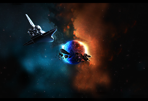 Another picture all done in photoshop. Anyone in 201 can do something like this, given the right shuttle picture and the tutorial for it as you need at most that and maybe a brush pack to do this. It is a beautiful shot of a red and blue colored planet. It also has the "badass" tone to it with the rocks floating around it. The stars and nebula are done exceptionally well too. I have done stuff like this before but I always lacked toe patience to do it right and decently. It shows just how powerful photoshop can be. This picture is an understatement though as it can do much more than this given the skill. People should go out and find tutorials and learn more and more if they have to. Even if you are not an artist, you can make something great just by following a simple tutorial on the web. Its ironic how awesome art can be taken from must have skill with hands and tools to the use of a mouse and a program.

 Those who never paid attention in class when talking about Ancient Greek and/or Roman Gods and their myths around them, probably does not have even the slightest clue about how to see this picture. First off, let me say this picture did not stand out greatly at me, but I found it interesting on how a simple idea worked pretty well and was kinda funny. The picture depicts Atlas taking a break. Atlas was a Titan who was condemned by Zeus to hold up world forever. Now you see here in this picture that Atlas is taking a break, so lets hope the world doesn’t end because of him. I believe there should be more new media artists that use ancient mythology in their works. Whether it be songs, games, pictures, or movies. I looked around and of course found some, but there should be more out in the open ones in the public world known by many. A GREAT example was the God of War series, but that is just a pebble in the sea of boulders.


 Ok so I am being redundant with this artist so this will be the last one for a while. This piece sure is different though. What catches my eye is the colors used, the great lighting and contrast, and especially the surrealistic look. It has a humanoid......thing almost like it is tied into this spider looking machine. I have no idea where he is going with this and I dont think he does either. He said he is not inspired with it so it is not moving along in the way he wants it. The title of the piece is called Magus Compo II. This is one of the first non model/CG work from Wen-jr, but............I do not get it. Though I still like how it looks. Surrealism has long roots in history and usually displays odd looking things like this. Not possible........yet.
 Ok, so I love swords and video games and animated movies. So what happens when a sword from an animated movie(CG) based off one of my favorite video games of all times is made by an artist? My mind explodes is what happens. This sword is just awesome. It is made up of 6 separate swords with different ranges and functions. However, I am here to discuss the picture. The detail on this work is just amazing. The small scratches and usage appears on it. The fabric it is on in the back is very details as well. Wen-jr yet again amazes me in his abilities. I hope to be able to do this in the future. Also a little note on this sword. The company who made the movie actually had the combing sword made but together it weights 720 pounds. Which is impossible for MOST people to pick up and wield. The guy in the ovie and game however wielding this like it was a stick.

 Aside from the deviantart logon watermark on it, this image is just beautiful. The lush green environment mixed with the housing built into the mountains there is something I wish I could see in real life today. If only, if only. Believe it or not, the artist did this in a matte painting followed by an IFX tutorial. Upon looking into it, I found an IFX was actually ImagineFX. A site and magazine dedicated to scifi and fantasy and more types of art. They even have tutorials I hear. I would check it out further but I can not draw or let alone paint so I will leave it up to the readears here to go check this out.

 This picture is aaaaaaaaammaaaaaaaaaaaaaaaaaaaaaaaaaa-zing! The great colors and contrast! The surreal and dreamy effects and lok. I love it all. The city or whatever it is on the cliff side and planes, flying machines, making the streams in the air are all just awesome. My favorite part though has to be the back of the image on the right. It looks like the sunset is on fire! The interesting par tthough is that this was a collaboration between two people on deviantart. Akajork and Pr3t3nd3r shifted a PSD between each other for about a month to get this result. Two great people put their abilities together and made something even better. I believe this would be a great thing for something like 201. Two People shifting a file back and forth, even if we are not the greatest artists, to get a better result. Two heads are better than one sometimes and this picture here shows it. You can get more out of a friend.

 There is a lot of blue but I really like this picture. I like most of this guy's work though. The contrast and color are just working with each other to make an epic picture. The swirl of water behind here is well done. She also has a huge sword so that helps make it even more epic. The female here is really well done as well. How he did this was thta he made the person in a modeling program and then used other programs such as photoshop to add the other effects. Though I do not have a quote for this, on his page you can see an example of how he does, actually multiple examples, where he has the models of some of his work posted on how he did it. I can not post them here since some of them have nudity since that is how a modeling program does it. This is one thing I hope to learn how to do in college next to making them for video games.
 I like this design because of the tons of different colors and the shape. The bakground is pretty soothing as well. However if you look closely, you can see a bird shape to it. That is th true intention of this artist. On the artist's deviant art, he made this to enter a Large art contest on a forum he goes to. I found this piece by browsing that forum. Which it is planetrenders.net. This is an abstract piece and these can sometimes be hard to read. I would not have noticed the bird without reading the discription that is an animal. The artist name is huMAC and his deviant art has other nice images you should check out. According to him, it is apparently "a Philippine epic book."
 I love this image. Many reasons why I can not put into words. But somethings I can explain is the balance of light and dark There is minimal light her, which is the source of being able to view this image in the first place. The title of the piece is Controlling Chaos. You look at the image and you see this strange, bubbly object that is twisting around with only 1 source of light in the background.